
Yesterday on StackOverflow, I came across one of those users that kept asking questions, but didn’t really seem to understand much of the responses. Looking at his profile, it turned out he had asked over a hundred questions, but contributed less than ten answers. I won’t be tempted to start about his capabilities of actually answering any SO questions (although his understanding of other’s answers to his own questions, except when he was able to copy-paste someone’s source code, also didn’t seem to be that great), but it did get me thinking about what a ‘common’ ratio of questions versus answers would be for other SO users (personally, I’m at 1/85 right now). Of course, that triggered my data-analysis and graphing gene…
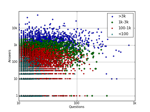
Using the StackOverflow public data set (the October 2009 one, which I still had lying around from last time), I set about plotting the number of questions versus the number of answers contributed by each user. This graph shows the raw results:

Clearly, several very active users tend to ‘specialize’ towards either the Questions or the Answers axis. One user is even up to almost 800 questions, but barely gave any answers. Can you earn reputation points that way? Sure, if they are good questions, other people will pass by that have hit the same dead-end and express their eternal gratitude of seeing their problem already solved by voting the question up. Here’s the same graph from before (except for the log-log axes) but including colors to show reputation classes:
The next graph plots each user’s reputation versus their “Q-to-A ratio” (their number of questions divided by their number of answers). For users without any answers I just plotted their number of questions (red dots).

The vast majority of users give much more answers than they have asked questions (so they have a Q/A-ratio of less than one) and inhabit the region near the horizontal axis. Most high-reputation users also tend to answer more than they ask. In the lower reputation regions (<1000) much higher Q/A-ratios can be seen (including those with an ‘infinite’ ratio, i.e. with no answers).
(As I found out later, someone else had already computed the top Q/A-ratios on an older SO dump, although I always prefer looking at things with some graphs…)
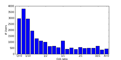
Finally, here are some Q/A-ratio distributions: the first one shows the number of users in each Q/A-ratio class. (Never mind the fact that the 1/1 class seems extraordinarily large in comparison to it’s neighbours, I’ve used a pretty strange class grouping function (an arctangens, so it can show both 0 and infinity symmetrically around 0) to make it fit properly on the graph.) The distribution is clearly weighted towards the right, again showing that most users have contributed more answers than questions.
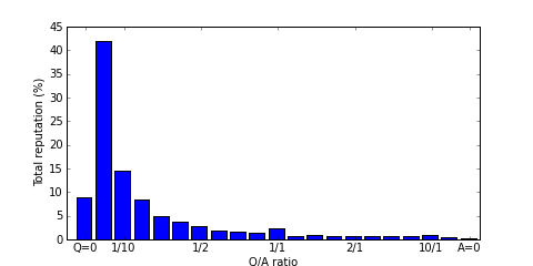
We can also weigh users by their reputation, so we get the fraction of total reputation that is represented by the users with a certain Q/A-ratio. The already large group on the left side of the Q/A scale becomes even more important now, meaning that most reputation is owned by users with a low (<1/10) Q-to-A ratio. This is confirmed by the next graph which shows the average reputation of all users in a given Q/A class.

This is a fascinating breakdown of the Stack Overflow community dynamics. I’ve always wondered about this myself – I’m somewhere in the middle with a decent answer-to-question ratio, but it’s interesting to see that some users can actually build reputation primarily through asking good questions. The graph you shared really illustrates how polarized user contributions can be, with some people clearly specializing in one direction or the other. I think your observation about that user with 100+ questions but minimal answers really highlights an important point about the difference between asking and understanding – it’s not just about volume, but whether you’re actually engaging with and learning from the responses you get.